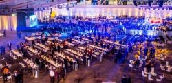
When it comes to events, it's easy for attendees to suffer from attention fatigue, but the thing is: It's not a problem of distraction. The issue is the event environment. Noisy, visually busy spaces can make attendees feel like they're being pulled in multiple directions, which builds cognitive overload. When brains are tired, engagement drops, which shows up in fewer meaningful conversations, lower session retention, and more people scrolling instead of participating.
According to Dr. Gloria Mark, attention fragmentation is a genuine phenomenon, and psychologists now measure the average time people stay on a screen not in minutes but in seconds. "These days, most of us live our lives tethered to our computers and our smartphones, which are unending sources of distraction," explains Kim Mills on the American Psychological Association's Speaking of Psychology podcast.
In this article, we're going to turn the science into practicality with layout-first strategies and advice on how to design zones that cue the right behavior, reduce mental clutter, and help guests stay focused on what they intended to do in each area of your event.
Key Takeaways: How to Reduce Attention Fatigue at Events
- Attention fatigue at events is caused by cognitive overload, not lack of interest. Noisy, visually busy, multi-purpose spaces force attendees to constantly reorient, draining mental energy.
- Clear zoning reduces decision fatigue. When guests understand “what happens here” within three seconds, they commit faster and engage more deeply.
- Intentional pacing prevents burnout. Designing decompression buffers and microbreak zones between high-stimulation sessions protects attention and retention.
- Visual and acoustic clutter shorten engagement. Strategic furniture placement, soft seating, drape, and defined sightlines reduce sensory overload and support meaningful conversations.
- Furniture shapes behavior. The right seating, tables, and layouts reinforce focus in learning zones, energy in networking areas, and calm in transition spaces.
- Layout-first planning improves session retention and guest satisfaction. An attention-first floorplan helps content land, conversations deepen, and participation increase.
Zone With Purpose: Make 'What Happens Here' Obvious in 3 Seconds
Ambiguity can lead to attention fatigue, especially when an area lacks a clear purpose. If guests can't tell at a glance what's going on in a space, they scan, wander, and mentally juggle options.
Many events blend multiple functions in a single space, which can lead guests to reorient. "Am I supposed to sit?" "Should I mingle?" "Do I need to wait?" The more options in a space, the more difficulty in committing to a behavior. Every moment of "figuring it out" is cognitive work.
"It might be hard to think of the last time you even had a tech-free hour," says Mills in the podcast. This means that your layout has to do the talking and eliminate confusion.
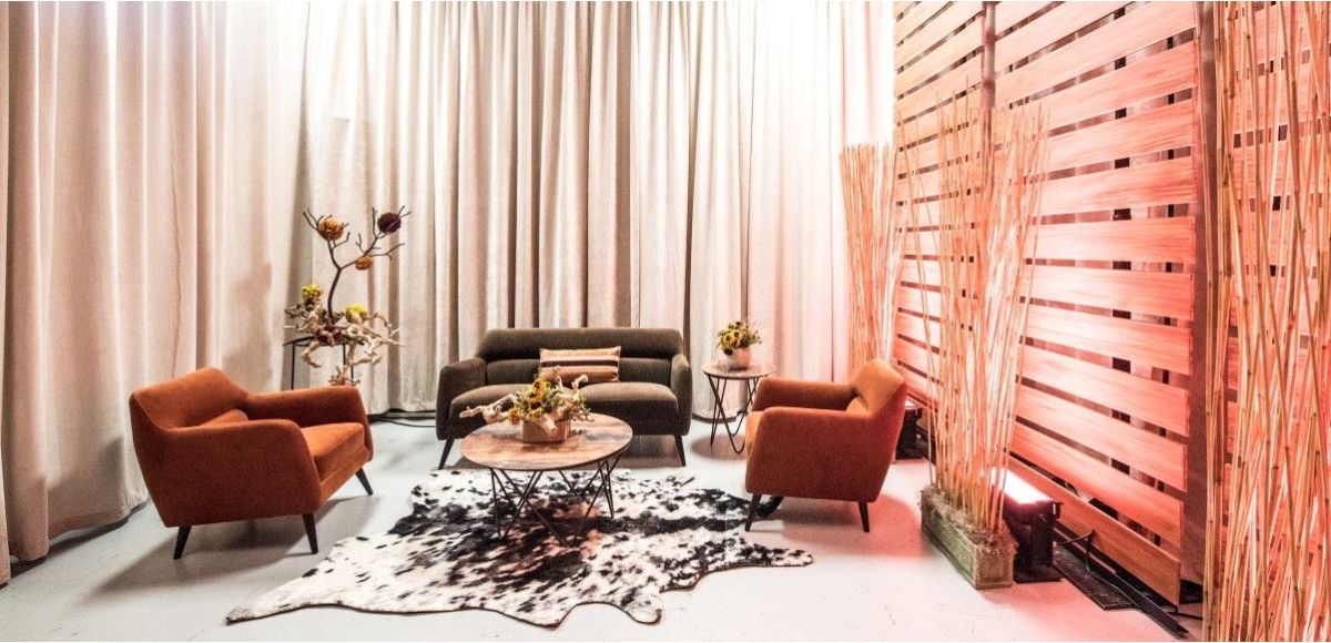
You can make things easier on your guests by building single-purpose zones with clear edges. Don't rely on signage alone; use furniture to define boundaries. Make sure your spaces have obvious "fronts" and "backs" with defined areas for the audience and circulation. Providing orientation cues in your furniture layouts and protecting sightlines also helps.
CORT Events can help you develop a zone strategy for your agenda — what needs energy vs. what requires calm. CORT also recommends furniture grouping that signals focus, allowing each area to be recognizable instantly and eliminating decision fatigue.
Design the 'Attention Rhythm': Use Pacing + Transitions to Prevent Cognitive Overload
Most events offer little to no transition time in between sessions, which means attendees can bound from a keynote to a breakout to lunch at breakneck speed. In these scenarios, the brain doesn't get a reset, and attention fragmentation becomes inevitable. Mark's research shows that frequent attention-switching carries a stress cost, regardless of how strong the content is.
You can remedy this by creating decompression buffers between high-input and high-output moments. Route attendees through a calmer corridor or lounge space rather than bouncing them from one stimulus-heavy area to another. Put microbreak areas every 20–30 yards that allow guests to sit for a moment. Put rushed traffic at the perimeter of the space to avoid fast traffic cutting through focus zones. Make sure your transition spaces aren't too tight or too wide.
CORT can help you separate your floorplan into higher-stimulation spaces and recovery areas and space out microbreak spots to improve flow without sacrificing energy. CORT's tools like Prismm can help you design a layout intentionally and mindfully and plan for microbreakout zones and decompression buffers.
Reduce Visual + Acoustic Noise: Protect Focus With Layout, Not Rules
"Quiet" doesn't just refer to volume; it's also about what your eyes have to process. Visual stimuli like multiple stages, bright activations, loud demos, and dense signage within one open area are the norm at too many events. This creates more work for the brain, leading attendees to feel tired faster, with conversations getting shorter and sessions feeling harder to follow.
There are several steps you can take to reduce visual and acoustic noise. Position stages with visual horizons to avoid attendees having to stare at foot traffic, vendor displays, or bars. Furniture can serve as acoustic zoning; use soft furniture and high-backed seating to create pockets of calm and reduce ambient noise. Angle networking away from doors to reduce distractions. Split visual noise by creating one "wow" per sightline.
CORT offers lounge groupings like the Beverly Ottomans that fit your layout, while soft seating like the Endless Collection can help reduce visual and acoustic noise. Drape and greenery can help create partitions.
Match Furniture to the Intended Behavior: Design for the Task, Not Just the Look
It's tempting to choose your furniture solely on looks, but that can be dangerous if it doesn't fit the task at hand. The wrong furniture creates fidgeting, wandering, posture fatigue, and early exits, especially in learning zones.
If the furniture is wrong, guests who are expecting focus and learning will experience discomfort and "microfriction" that pushes them toward distraction in an environment that encourages scanning and switching, with standing-room clusters, uncomfortable seating, and unclear surfaces for notes or devices.
In an area for keynotes and presentations, opt for chairs that can be comfortable for 30–60 minutes. Align your rows to reduce visual noise and include center and side aisles to reduce disruption.
When designing a space for breakouts and workshops, use classroom settings or crescent layouts for note-taking. Stable surfaces like tables are ideal turning devices from distractions into learning tools.
For a networking lounge, limit group seating to 3–5 to avoid overly closed-off or noisy groupings. Mixed-height tables support a range of energy levels well.
CORT's expert consultants can help you choose the right furniture for the right behavior for the right zone. This allows you to tailor the space to meet the agenda — whether it's focus, learning, or connection — rather than fighting it.
Build Spaces That Hold Attention So Your Content Can Land
Attention fatigue is a phenomenon that's genuine and rising, but you have more control over it than you might realize. Making your layouts suit the purpose of each zone, allow for recovery, and reduce sensory overload allows your guests to stay present at the event.
If your event centers on learning, connection, or decision-making, an "attention-first" floorplan with the right furniture can reinforce focus. CORT Events can help you with zones, pacing, and furniture choices that engage and satisfy guests while keeping them calm.
Attention fatigue is real, and it's rising, but planners have more control than they think. When your layout makes each zone's purpose clear instantly, builds in recovery moments, and reduces visual/acoustic overload, you give attendees the conditions they need to stay present.